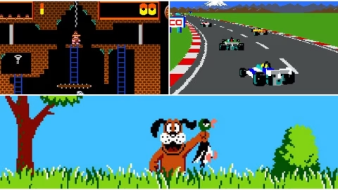
Pixel art was never meant to chase realism. It existed because of limits, tight memory, small color palettes, and hardware that demanded clever shortcuts. Those limits ended up shaping an art form that still looks stunning decades later. Playing these games today, I am constantly reminded that visual beauty does not depend on resolution, but on intention.
What stands out most is how confident many of these games feel in their presentation. They are not trying to impress with spectacle or scale. They focus on readability, personality, and atmosphere, and that focus allows them to age with remarkable grace. In 2026, these pixel-driven worlds still feel alive, expressive, and carefully crafted.
Super Mario World and Timeless Color Design
Super Mario World remains one of the clearest examples of pixel art that refuses to age. The color palette is bright without being harsh, and every environment is instantly readable. Characters pop from the background, enemies are recognizable at a glance, and animations convey emotion with minimal detail.
What keeps the visuals feeling fresh is consistency. Every sprite fits naturally into the world, from the rolling hills to the smallest moving platform. The game never overloads the screen, allowing the art to breathe. Even after countless hours, the visuals remain inviting rather than exhausting.
The Legend of Zelda: A Link to the Past and Layered Worlds
A Link to the Past delivers pixel art that feels rich and deliberate. The world is packed with detail, yet nothing feels cluttered or distracting. Trees, water, buildings, and interiors all share a cohesive style that makes exploration feel rewarding.
The use of lighting and contrast elevates the visuals even further. Dungeons feel oppressive and mysterious, while the overworld feels open and welcoming. These subtle shifts in tone help sell the fantasy without relying on advanced effects. Even now, the game feels visually complete in a way many modern titles struggle to achieve.
Chrono Trigger and Expressive Character Art
Chrono Trigger proves how powerful character design can be within strict technical limits. Each character’s personality is visible through posture, movement, and small animation details. Dialogue portraits reinforce those traits, making the cast feel emotionally present.
Backgrounds complement the characters rather than competing with them. Whether exploring a prehistoric jungle or a futuristic city, the art style remains consistent and purposeful. The balance between detail and simplicity ensures that the game still feels polished and readable today.
Castlevania: Symphony of the Night and Gothic Elegance
Symphony of the Night represents pixel art at its most ambitious. The gothic architecture, detailed enemy designs, and fluid animations push the limits of what 2D art could achieve at the time. Every hallway, chamber, and tower feels carefully composed.
What stands out most is the animation quality. Characters move with weight and intention, making combat feel visually satisfying. Particle effects, lighting tricks, and layered backgrounds add depth without breaking immersion. The result is a game that still looks luxurious in 2026.
Metal Slug and Hand-Drawn Chaos
Metal Slug embraces excess, and that is exactly why it holds up so well. The sprites are packed with detail, often animated frame by frame in ways that feel almost absurdly generous. Explosions, enemies, and environmental destruction all contribute to a sense of controlled chaos.
Despite the visual density, the game never becomes unreadable. Foreground and background elements are carefully separated, ensuring clarity even during intense action. The humor embedded in the animations adds personality that modern realism often lacks. It feels playful, confident, and timeless.
Street Fighter III: Third Strike and Fluid Motion
Third Strike is often praised for its animation, and that praise remains deserved. Every character moves with a sense of rhythm and weight that feels almost lifelike. Attacks flow naturally into one another, creating a visual language that communicates skill and timing.
The backgrounds complement the action without stealing focus. Crowds move subtly, environments react, and colors remain balanced throughout. The game feels alive, even when nothing is happening on screen. That attention to motion is why it continues to look stunning today.
EarthBound and Minimalist Charm
EarthBound takes a different approach by leaning into simplicity. The visuals are clean, quirky, and intentionally understated. Characters are small, environments are straightforward, and the art avoids unnecessary embellishment.
That restraint gives the game its charm. The world feels approachable and oddly comforting, even during darker moments. Visual humor appears in unexpected places, reinforcing the game’s unique tone. The pixel art still feels fresh because it never tried to be impressive in a conventional sense.
Mega Man X and Mechanical Precision
Mega Man X delivers pixel art that feels sharp and deliberate. Characters are cleanly designed, with strong silhouettes that remain clear during fast-paced action. Enemy designs communicate behavior instantly, which is critical in a game built around reaction and timing.
Stages use color and geometry to guide movement naturally. Hazards stand out without feeling intrusive, and backgrounds provide atmosphere without clutter. The visual clarity ensures that the challenge feels fair rather than overwhelming. That balance keeps the game visually satisfying decades later.
Final Fantasy VI and Emotional Storytelling
Final Fantasy VI shows how pixel art can support emotional storytelling. Character sprites convey mood through subtle animations and staging. Scenes of loss, triumph, and tension feel impactful despite the limited detail.
The environments play a major role in that storytelling. Towns feel lived-in, ruins feel abandoned, and battle scenes feel dramatic. The use of perspective and layering creates depth without sacrificing clarity. Even in 2026, the game’s visuals carry emotional weight.
Sonic the Hedgehog 2 and Speed-Friendly Design
Sonic the Hedgehog 2 proves that pixel art can support speed without falling apart. Levels are designed to remain readable even when moving quickly. Colors shift smoothly between zones, creating strong visual identity without confusion.
Character animation sells momentum perfectly. Sonic’s movements communicate speed, hesitation, and impact through simple but effective frames. The game still feels visually exciting because every element serves the gameplay rather than distracting from it.
Donkey Kong Country and Pre-Rendered Boldness
Donkey Kong Country took a controversial approach by using pre-rendered sprites, yet the result has aged surprisingly well. The characters and environments maintain a cohesive look that feels intentional rather than dated. Lighting and shading add depth without breaking the visual style.
The backgrounds deserve special attention. Layers of foliage, water, and atmospheric effects create a sense of space rarely seen at the time. Even now, the game feels visually rich and immersive. Its confidence in presentation helps it stand out decades later.
Why Pixel Art Ages Better Than Expected
Pixel art ages well because it does not chase realism. It accepts abstraction and leans into stylization. That choice frees it from the uncanny valley that traps many early 3D games.
Another reason is clarity. Good pixel art prioritizes readability, ensuring that important elements stand out. This focus aligns perfectly with gameplay, reinforcing player control and awareness. The result feels timeless rather than obsolete.
Pixel art also benefits from consistency. Limited palettes force careful decisions, leading to cohesive worlds that feel complete. That unity is difficult to replicate with higher fidelity visuals that often clash in tone or detail.
Playing These Games in 2026
Revisiting these games in 2026 feels less like nostalgia and more like appreciation. Modern displays, emulation, and re-releases allow the art to shine without distortion. Clean scaling and optional enhancements preserve the original intent while improving comfort.
What surprises me most is how modern many of these visuals feel when placed alongside indie releases. Pixel art remains a popular choice because it communicates ideas efficiently and beautifully. These retro titles do not feel out of place, which speaks volumes about their design quality.
The experience also highlights how much care went into every frame. Nothing feels wasted or accidental. That level of craftsmanship continues to resonate, even as technology evolves.
Final Thoughts
Pixel art perfection is not about technical limitations, but about creative discipline. The games that aged beautifully did so because they understood their tools and used them with confidence. Every sprite, animation, and background served a purpose.
Returning to these titles reminds me that beauty in games is not tied to realism or scale. It lives in clarity, consistency, and personality. That is why these pixel-driven worlds still feel vibrant in 2026, long after their hardware faded into history.